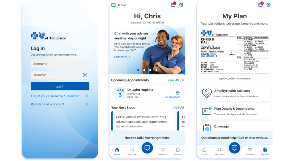
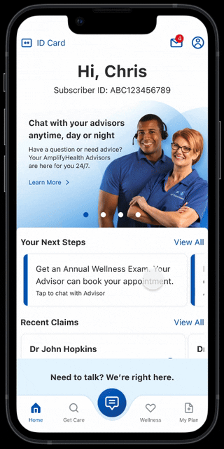
As part of an enterprise initiative, a new product was launched to provide 24/7 access to dedicated health advisors who help members address gaps in care. The new AmplifyHealth app will be the central hub of the member experience.
Increase Care Management
Engagement
Telemedicine Care
Utilization
Decrease Inpatient
Readmissions
Information
Architecture
Interaction
Design
Userflows
Wireframing
Lo-fi to Hi-fi
Prototypes
Design
Documentation
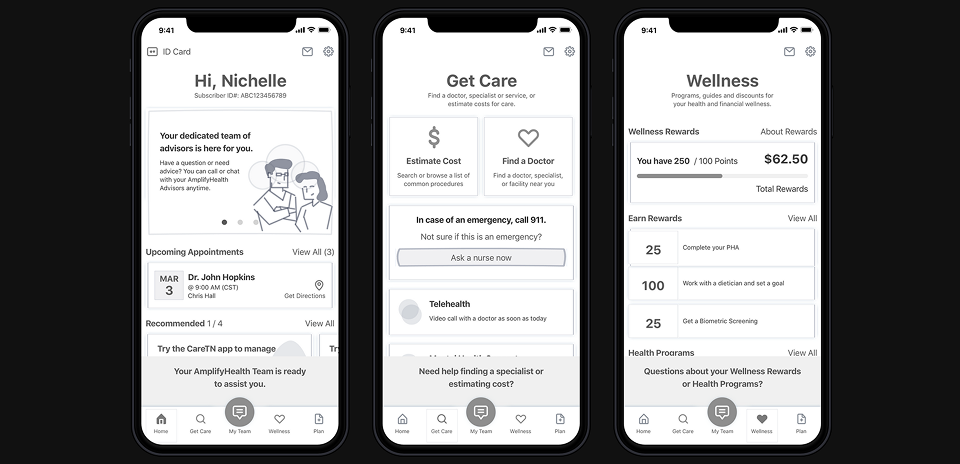
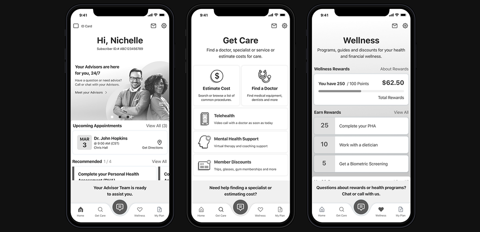
Building on the foundational design system established for the BCBSTN app. The goal is to educate members by introducing AmplifyHealth Advisor team, early and often highlighting into the dashboard and prompts members to connect via phone or chat.
The additional features of the app will provide personalized and timely engagement for the members, this includes enhanced inbox (expanded Document Center and Notifications) actions needed and recommendations coming from Advisors. Surfacing "next-best action" for members need to take based on their health journey. Integrating Appointment scheduling, Teladoc virtual care and prioritized providers served up in the Find Care and Cost Estimator tools to guide members toward better and more affordable care options.
Gather research and analyze problems
Assess pain points, evaluate constraints
Design, userflows and test solutions
System design, documentation and handoff
To inform our design decisions and ensure a user experience that meets and exceeds industry standards, we conducted an in-depth competitive research analysis. This included a detailed review of 11 direct competitors within the advocacy space, focusing on user flows, navigation models, content strategies, visual design, and feature sets. We assessed how each organization structured their calls to action, managed member engagement, and presented complex information to a diverse user base. Key insights from this analysis revealed common usability challenges, as well as successful patterns in mobile responsiveness and personalized content delivery.
In addition to direct competitors, we expanded our scope by analyzing 18 best-in-class apps across a variety of industries, including finance, healthcare, e-commerce, and education. This cross-industry audit allowed us to benchmark against top-tier digital experiences known for their innovation and usability. We paid particular attention to onboarding flows, notification systems, content discoverability, and accessibility practices. These broader insights helped inspire solutions that were not only functional and familiar to users, but also differentiated the app in a crowded market. The findings from this competitive research directly shaped our design strategy and informed key product decisions throughout the development process.
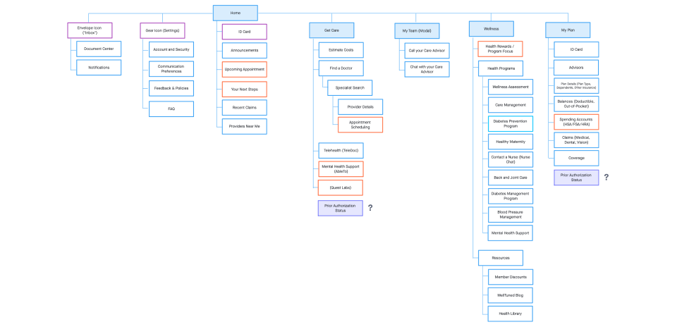
To ensure the app’s information architecture was both intuitive and user-friendly, our team conducted five iterative UX tests, each building on insights from the previous. We began with an open card sort, allowing users to organize content into self-defined groups and label them, uncovering natural mental models. This was followed by a closed card sort, where users categorized the same content using pre-defined labels to test clarity and alignment with user expectations.
Next, we ran a tree test (Phase 1), asking users to locate specific information within a draft site map to identify pain points in labeling and structure. Based on these findings, we refined the site map and ran tree test (Phase 2) with the same tasks to validate improvements. Finally, we conducted a click test using low-fidelity wireframes, where users clicked through the interface to find key information. This confirmed that the hierarchy and structure supported intuitive navigation, ensuring the app’s core features were easily discoverable.
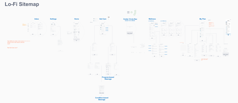
With user insights gathered from initial research, I began crafting a series of low-fidelity wireframes and user flows to explore solutions for each core functionality of the app. These early design explorations focused on addressing key usability pain points while aligning closely with user mental models and expectations.
Once the foundational interaction patterns were defined, I created a mid-fidelity grayscale interactive prototype to visualize the app’s structure and functionality more clearly. This prototype was used in moderated usability testing sessions with representative users to collect qualitative feedback. The goal of these sessions was to assess the intuitiveness, functional completeness, and overall user experience of the design. Insights from this phase directly informed the refinement of key features and the overall user journey.
In the next phase, I synthesized the user feedback to create two distinct prototype variations. These were designed for A/B testing, with a focus on evaluating specific aspects such as navigation structure, visual hierarchy, and overall app architecture. Collaborating closely with the UX research team, we conducted a comparative analysis of user interactions and behavioral patterns across both versions. This iterative evaluation helped us identify which design elements were most effective in terms of usability, clarity, and user engagement.
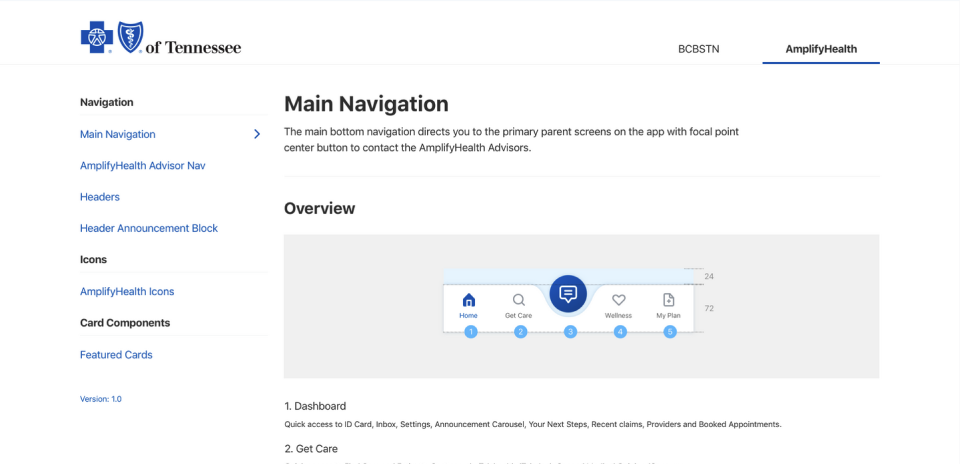
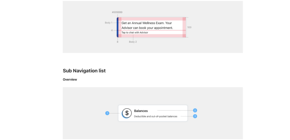
After securing approval on the final designs, I shifted focus to building a robust design system. This involved defining and documenting foundational UI elements and creating a library of reusable components tailored specifically for AmplifyHealth. I introduced a dedicated section within the app’s documentation to house these new components, including detailed specifications and annotations for elements such as headers, navigation patterns, buttons, and layout templates. This ensured visual consistency and supported future scalability.
Next, I compiled all high-fidelity screens into a complete, interactive prototype that illustrated all primary user flows. Our team utilized Sketch for design and InVision for prototyping, allowing me to take advantage of InVision’s interactive capabilities to simulate complex transitions and microinteractions within the app.
To streamline handoff, I shared both the interactive prototype and supporting documentation with the engineering team through centralized links and an organized asset folder. Throughout the implementation phase, we held weekly syncs with stakeholders and developers to ensure alignment. These sessions provided opportunities to answer questions, clarify design rationale, and collaboratively resolve technical limitations—while preserving the integrity of the user experience.