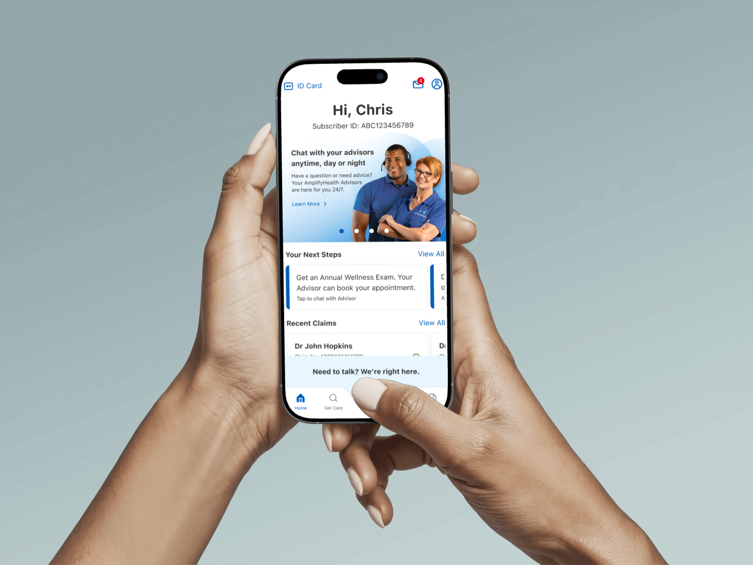
AmplifyHealth App
The product was launched as part of an enterprise initiative providing 24/7 access to dedicated health advisors helping members to address gaps in care.
Team
Responsibilities
Engagement
Utilization
Readmissions
Product Goal
Connect members to AmplifyHealth Advisor team via call or chat using the app, surfacing "next-best action" for members need to take based on their health journey.
Discovery
Gather research and analyze problems
Define
Assess pain points, evaluate constraints
Ideate
Design, userflows and test solutions
Implementation
System design, Documentation
Discovery
The research team conducted an in-depth competitive analysis review of direct competitors focusing on navigation models, content, design and feature sets. We assessed how each organization structured their calls to action, managed member engagement, and presented information to a diverse user base.
In addition to direct competitors, we expanded our scope by analyzing best-in-class apps across a variety of industries. This cross-industry audit allowed us to benchmark against top-tier digital experiences known for their innovation and usability. The findings from this competitive research directly shaped our design strategy and informed key product decisions throughout the development process.
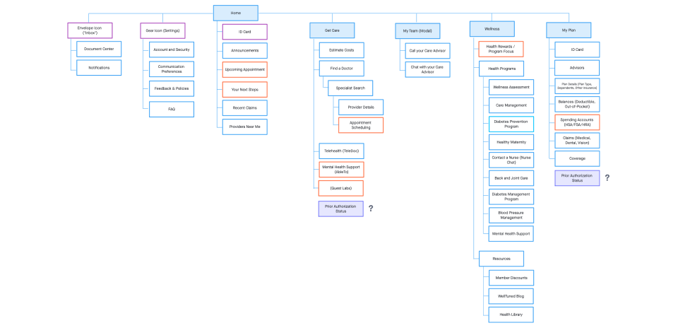
Define
To define the app’s information architecture, our team conducted iterative UX tests, each building on insights from the previous. We began with an open card sort, allowing users to organize content into self-defined groups and label them. This was followed by a closed card sort, where users categorized the same content using pre-defined labels to test clarity and alignment with user expectations.
Next, we ran a tree test (Phase 1), asking users to locate specific information within a draft sitemap to identify pain points in labeling and structure. Based on these findings, we refined the site map and ran tree test (Phase 2) with the same tasks to validate improvements.
Finally, we conducted a click test using low-fidelity wireframes, where users clicked through the interface to find key information. This confirmed that the hierarchy and structure supported intuitive navigation, ensuring the app’s core features were easily discoverable.
Ideate > Testing
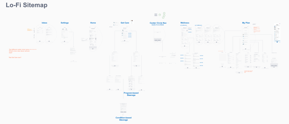
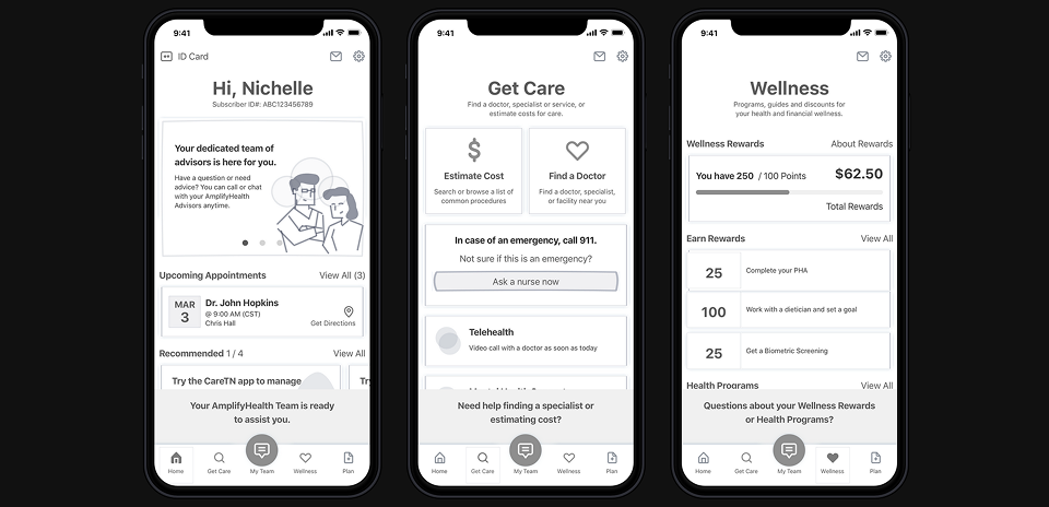
Lo-fi ConceptWith the navigational sitemap already structured, I began crafting a series of low-fidelity wireframes and user flows to explore solutions for each core functionality of the app. These early design explorations allows us to test different approaches of components, labels and call to actions.
Once we had the concept that successfully tested, I then created and refined the prototype to mid-fidelity grayscale to visualize the app’s structure more clearly and get closed to the actual experience. We've run a quick test to validate without being bogged down with visual colors that can affect their decisions and get honest feedback.
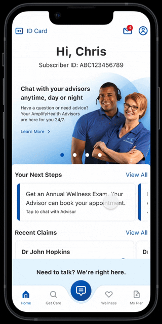
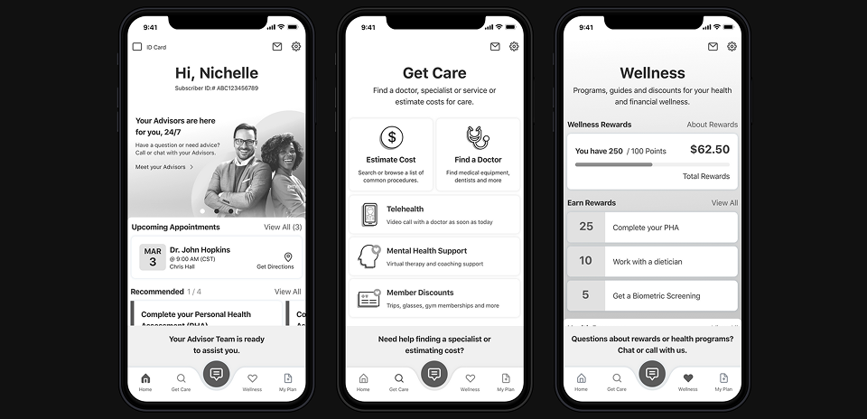
I began applying brand system colors and compiled all user flows into high-fidelity screens. The interactive prototype utilizing InVision's animated frame transitions to simulate microinteractions within the app. To ensure alignment with user expectations, the team conducted another round of moderated testing to validated our decisions, particularly for critical journeys like onboarding, getting care and post-care.
Implementation
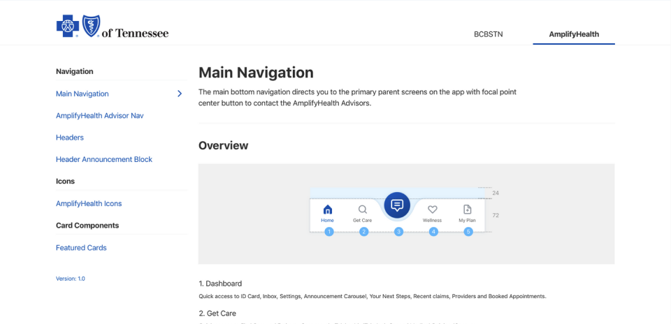
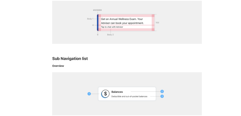
After securing approval on the final designs, I shifted focus to defining and documenting foundational UI elements and creating a library of reusable components tailored specifically for AmplifyHealth. I introduced a dedicated section within the app’s documentation to house these new components, including detailed specifications and annotations for elements such as headers, navigation and card components.
To streamline handoff, I shared both the interactive prototype and supporting documentation with the engineering team through centralized links and an organized asset folder. We held weekly syncs with stakeholders and developers to ensure alignment and providing opportunities to answer questions and guidance during the implementation.