Before the released of BCBSTN’s mobile app in August 2021, I developed a comprehensive design system from ground-up establishing foundation and guidelines standardizing UI, enhanced usability, and accelerated design-to-development handoff through shared libraries and detailed documentation.
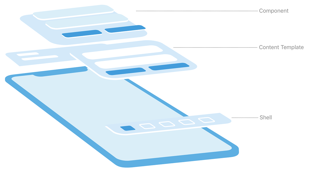
Outlining the structure of the library system
Established main foundational elements & building blocks
Set up component library and screen patterns
Document specifications, guidelines and edge cases
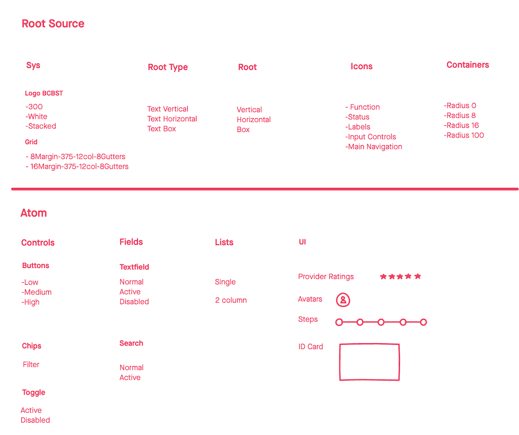
I began the process by outlining overall design architecture using atomic design principles. This include categorizing components into atoms (e.g., buttons, fields, icons), molecules (content elements, selection lists), organisms (navigation, card lists, modals), and screen-shell templates.
The system map acted as both an inventory and a blueprint, helping identify what was reusable, what needed refinement, and what could be consolidated.
The early planning phase played a crucial role in defining the scope and structure of the system before investing time in high-fidelity component design. By staying at a low-fidelity, abstract level, it allow us to focus on functionality, hierarchy, and relationships between components rather than detail specifications. It also enabled faster decision-making, clarifying priorities, aligning on terminology, naming conventions and implementation.
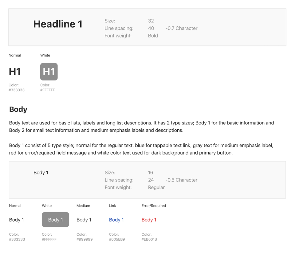
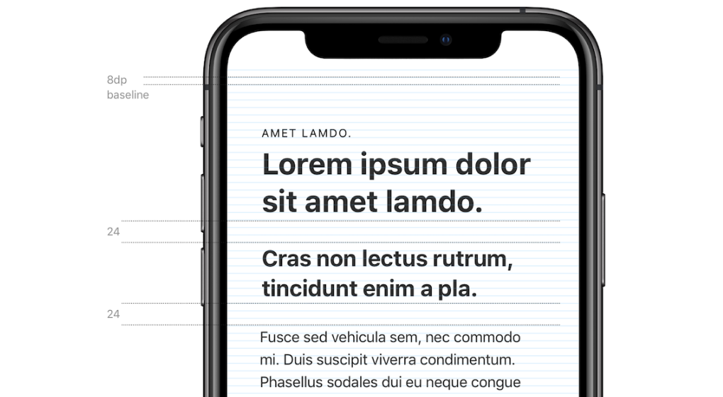
Starting with typography as a foundation, simplifying the headers into three levels of hierarchy primarily used for parent page titles, child headers and highlighting costs. Body text are defined by two levels to support content with varying emphasis. Body 1 is used for general content and descriptions. Body 2 is used for medium emphasis such as sub-labels and footnotes.
To maintain a native feel on both iOS and Android platforms, we chose system default typefaces SF Pro Text for iOS and Roboto for Android. Using platform-native fonts also helped reduce app weight and improved loading performance.
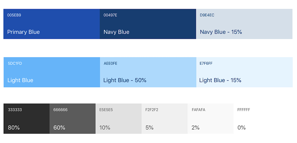
Brand colors of BlueCross BlueShield of Tennessee was used as system colors for primary and secondary UI elements such as buttons, links, and key highlights. Status colors were also defined to indicate success, errors and warnings. A neutral gray colors was setup for surfaces, borders, and typography to support a clear visual hierarchy and maintain balance throughout the interface.
Spacing system based on an 8pt grid to maintain visual rhythm and structure and layout consistency. This grid governed padding, margins, and component alignment across all screens, ensuring scalability across devices.
Elevations applied only to elements that needed to stand out, such as action cards and modals helping users quickly differentiate between layered content and actionable components.
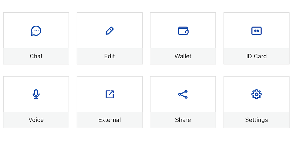
For iconography, I've adopted the open-source Eva Icons set due to its clean, consistent stroke style and strong legibility at small sizes. Icons were categorized by functions, labels, status and navigation.
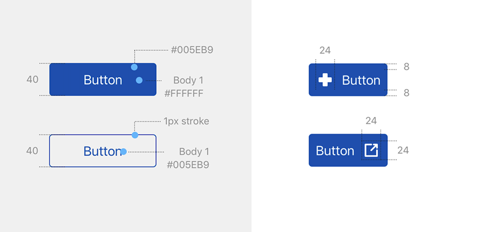
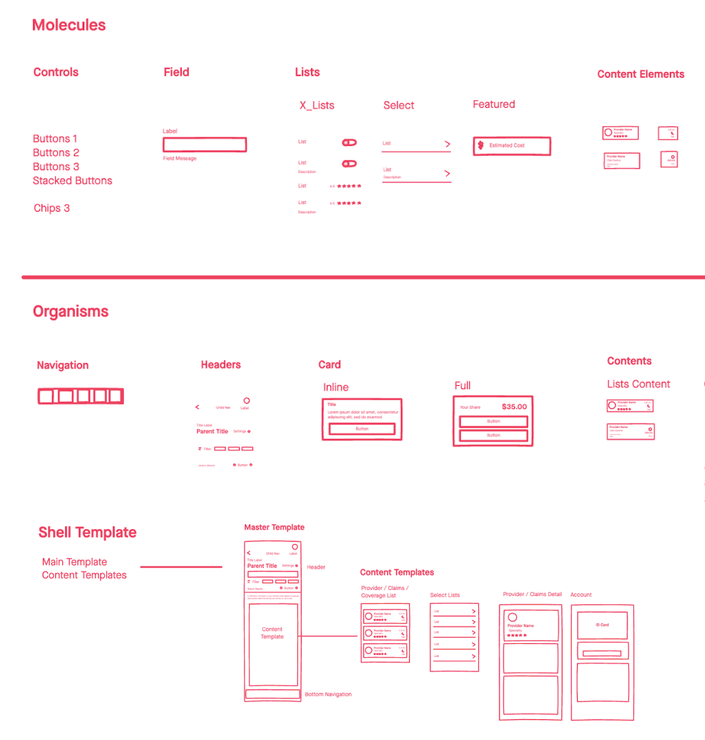
With the foundational styles defined, I moved on to building components at the atom level creating elements for text containers, buttons, fields and lists.
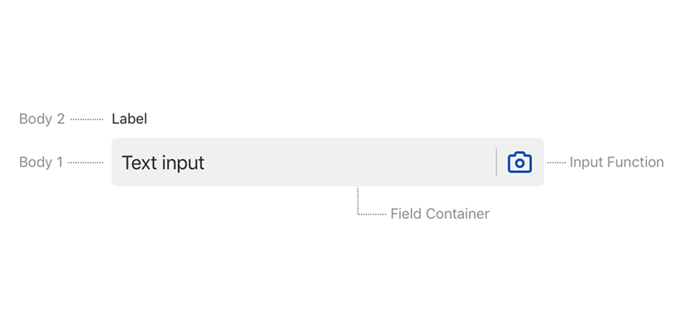
These atoms were then composed into molecules, such as stacked buttons, labeled fields, search and content elements with icons. Further, I then construct the organisms like navigation bar and top headers that could be dropped into screen templates.
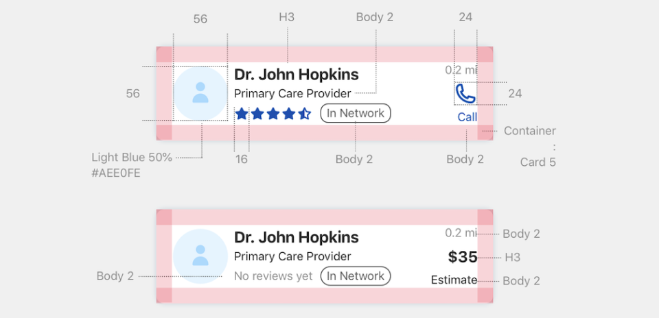
I start creating card components including variations for content display, CTA integration, and contextual icons. Whether showing lists of providers, claims, or plan coverages, each card served as a building block for structured information.
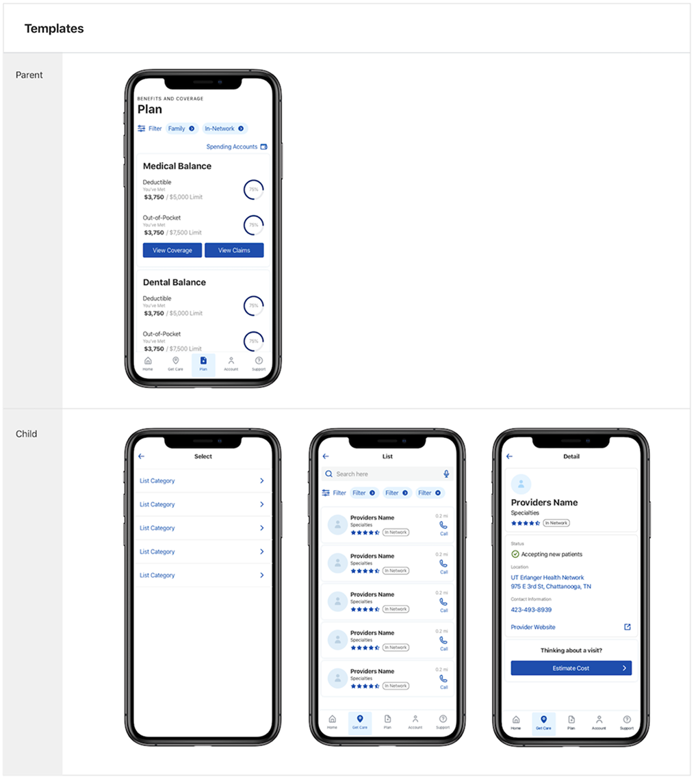
After the library of components was finalized, we've identify predictable interaction patterns across the product and develop shell templates. Setting up a clear pattern for viewing lists (e.g., claims, coverages, providers) category selections and going into detailed screens.
Each screen followed a familiar layout for users reducing cognitive load and increasing their confidence as they moved through the app.
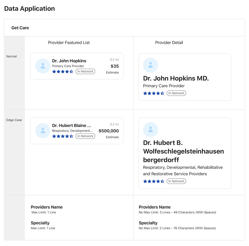
I developed a comprehensive design system documentation hub that served as a single source of truth for the entire product team. This documentation played a critical role in driving alignment between design and engineering throughout the development process. By clearly outlining usage guidelines, specifications and edge-case behavior, it served as a reliable reference point for both teams at every stage.
As a result, This improved handoff process minimized back-and-forth revisions with less ambiguity during implementation and matched the design prototypes translation to production.
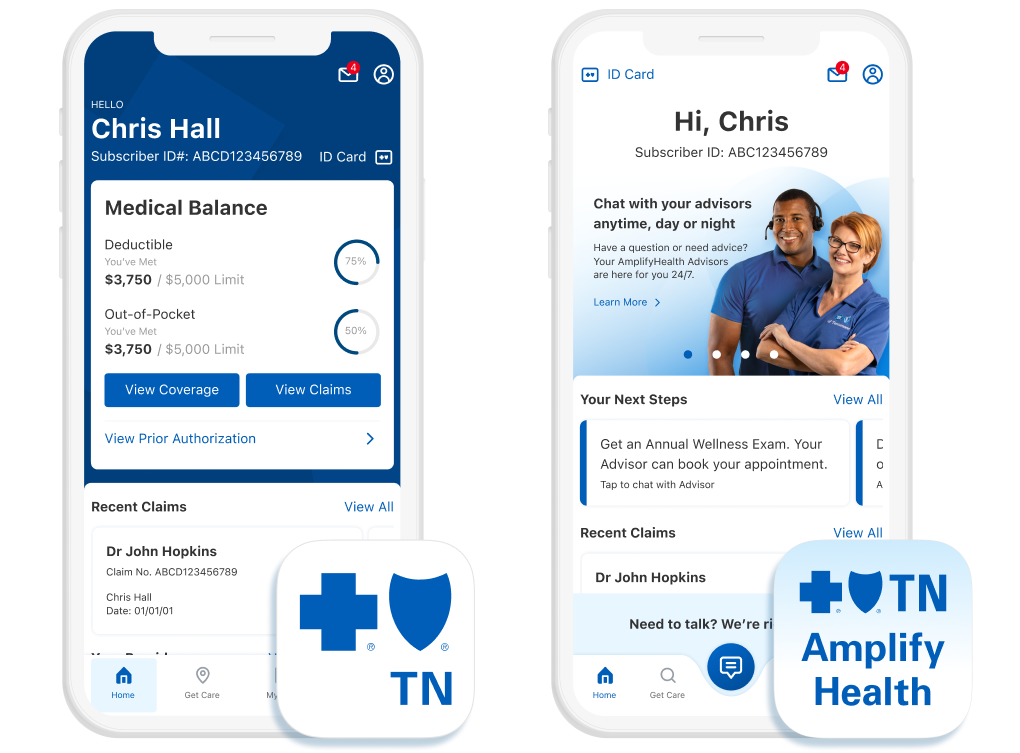
The scalability of the design system proved valuable when the organization launched a new business initiative: developing a separate mobile app for an entirely new product. Because the design system was well-documented and modular, it was easily repurposed and extended for the new app, drastically reducing design time and development complexity.
Instead of starting from scratch, the team was able to reuse foundational elements, UI patterns, and components—allowing us to maintain brand consistency while tailoring the experience for a different user journey. This demonstrated the design system’s long-term impact across the organization.