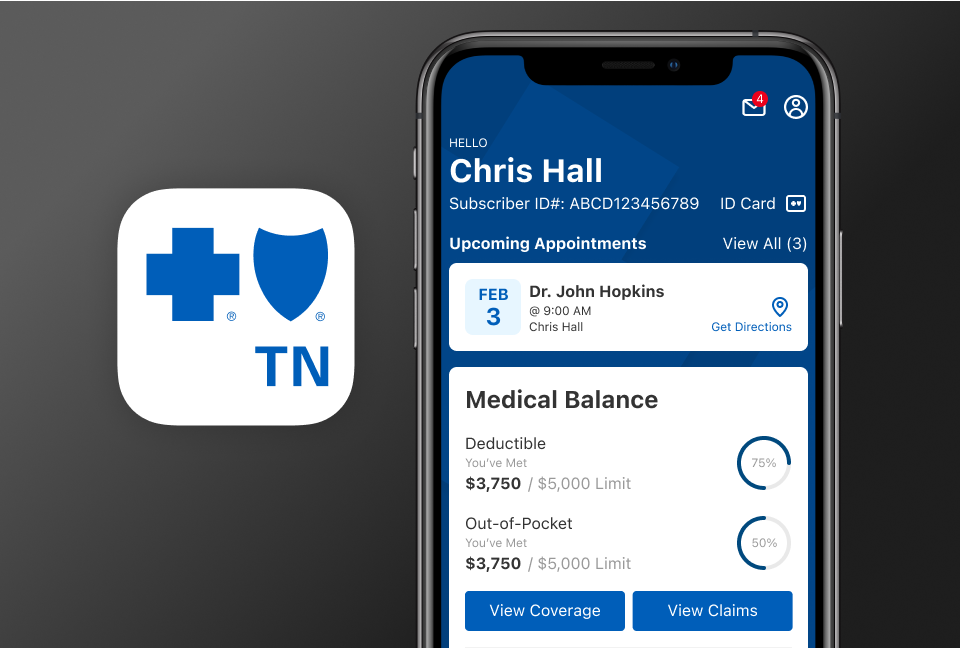
BCBSTN Mobile App Icon
The redesigned badge resulted in a 20% increase in app store CTR and improved members perception of the app due to its strong alignment with the brand and user expectations reflected in positive reviews during research phase.
Responsibilities

Product Goal
Design a new icon to ensure the badge resonates the new mobile app design and validate the badge’s clarity and confidence enhancing brand consistency and users trust while adhering to current iOS and Google playstore design guidelines.
Discovery
To begin, I conducted a competitive analysis of health insurance apps and leading apps from different industries such as finance and wellness. This helped identify common visual patterns, successful iconography, and emerging trends.
The next step was ensuring that the icon badge would meet the requirements of the brand regulations. I began by reviewing the company’s Associations Brand Guidelines, this include the proper usage of cross and shield iconography and it was essential to show the geographic location of the company.
Design Concepts
To align the icon in meaningful context, I gathered industry-relevant terminology and keywords from internal business materials and member surveys and feedbacks. Terms like "health," "wellbeing," emerged frequently.
Using these insights, I began sketching initial concepts, exploring a variety of visual metaphors from cross, shields and hearts. I also explored some ideas that represents the state of Tennessee.
I converted the initial sketches into vector illustrations and apply the brand colors to experiment and integrated the concepts into various digital platform mockups to visualize how the design looks in different interfaces. The concepts were then presented to brand design team and leadership to gather feedback, leading to several rounds of iterative reviews and refinements.
Test and Implementation
We narrowed down the recommended designs, and the most appealing to the team is the simplified cross and shield icon with positive reactions about being modern, clean, and updated, while still retaining the brand identity. A key update from the previous badge was removing the 'myBlue' name to the app badge and changing the name to 'BCBSTN,' using the abbreviation for BlueCross BlueShield of Tennessee. This improves recognition, scalability and readability at smaller dimensions.
To validate our direction, we tested three different versions of the app badge to gather user insights. We asked members which icon was easiest to identify, which one stood out the most, and which best represented our brand. Participants completed click-test tasks that involved locating the app in App Store search results and on the mobile phone home screen.
Although all designs performed relatively well during testing, Option 2 stood out in overall performance—particularly in conveying brand confidence and supporting user task success.
Following the selection approval, I worked closely with the development team for implementation of the updated design, exporting assets to specific platforms and sharing assets to the brand design team for print marketing materials.