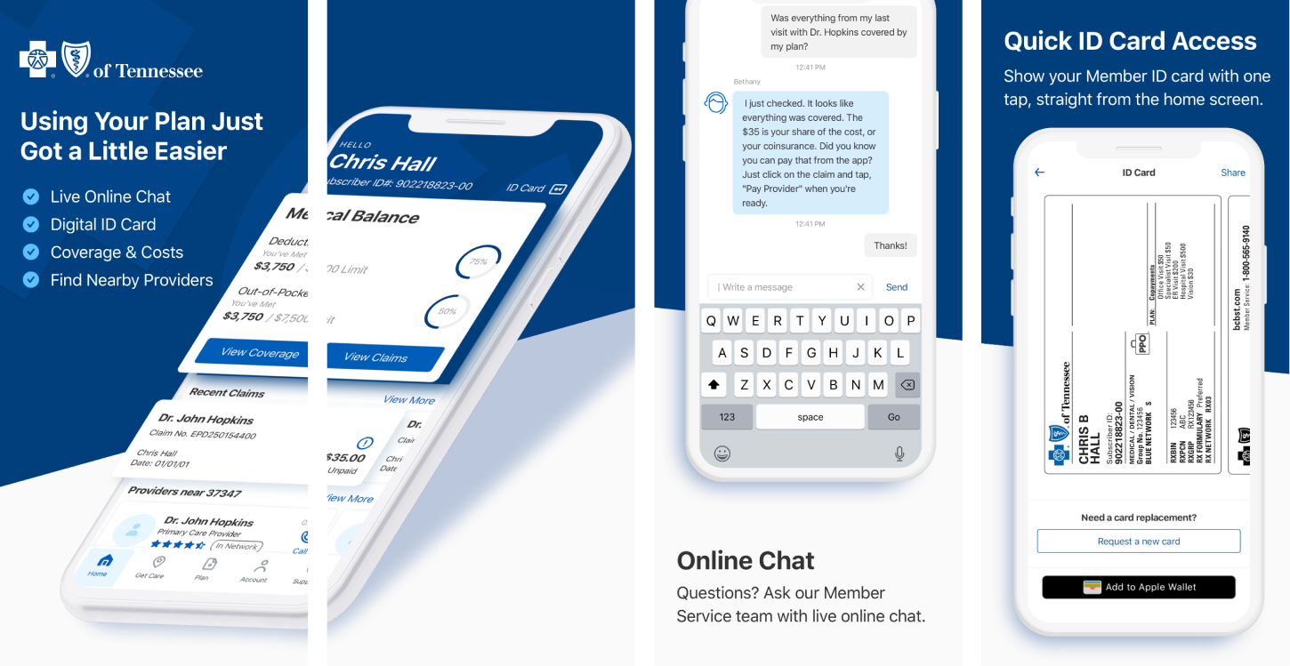
App Store Preview
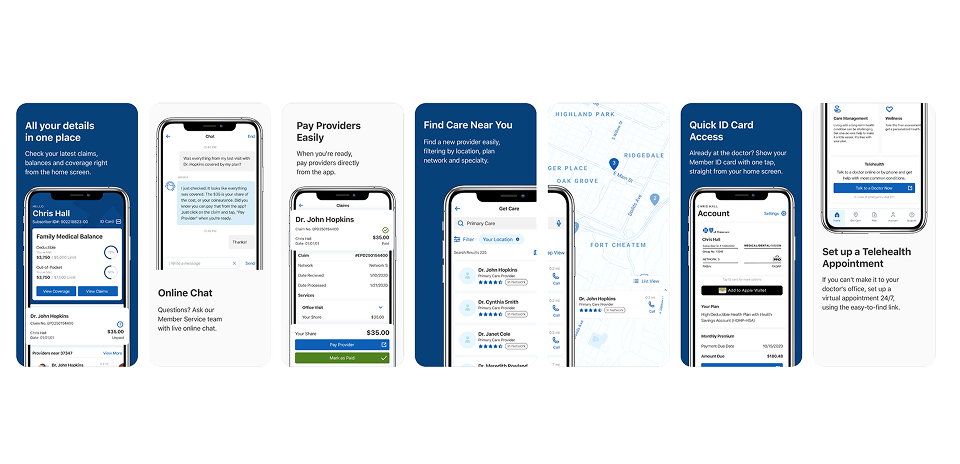
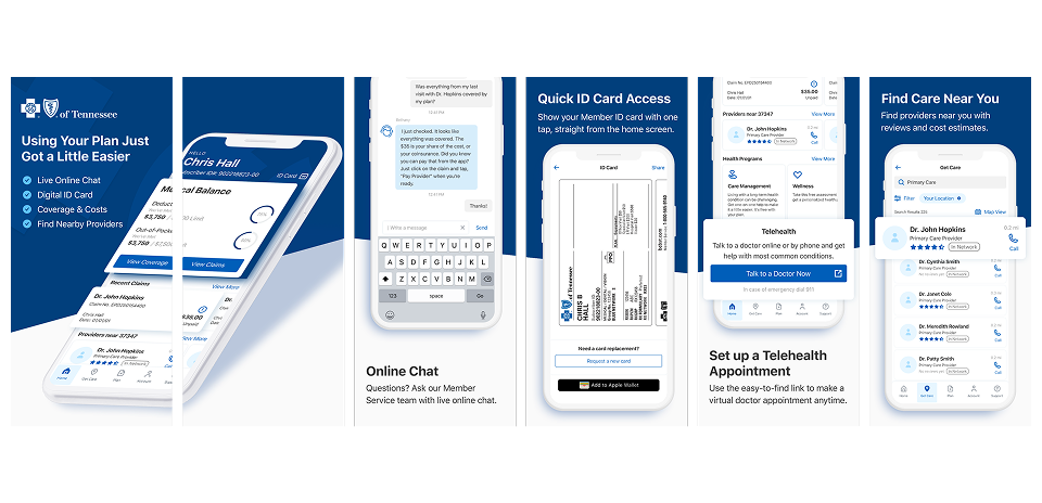
I designed and updated the App Store preview to clearly showcase key features such as accessing a Digital ID Card, Live Chat, and Telehealth Access in order to communicate value, reinforce trust, and reflect the app’s updated UI.
Discovery
Identify features, gather insights best practices
Storyboard
Draw concepts outlining app core's functions
High-Fidelity Design
Explore versions of Hi-fi designs
Implementation
Optimize specifications, deliver final assets
Discover
During the discovery phase, I collaborated closely with the product team to identify the key features that would serve as selling points for our target users during the app launch. Since the previous version of the app doesn't have a chat feature, the team wanted to highlight the integrated chat support functionality. User data also revealed that quick access to the digital ID card and Telehealth appointments especially during the hieght of the pandemic are among the most frequently used features. Additionally, the product team emphasized the importance of showcasing the new provider search with the integrated API.
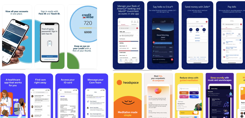
I gathered references from app previews of both direct competitors in the healthcare space and successful apps from different industries and conducted a thorough review of the Apple App Store and Google Play Store guidelines to ensure our preview would meet all technical and content requirements for both platforms.
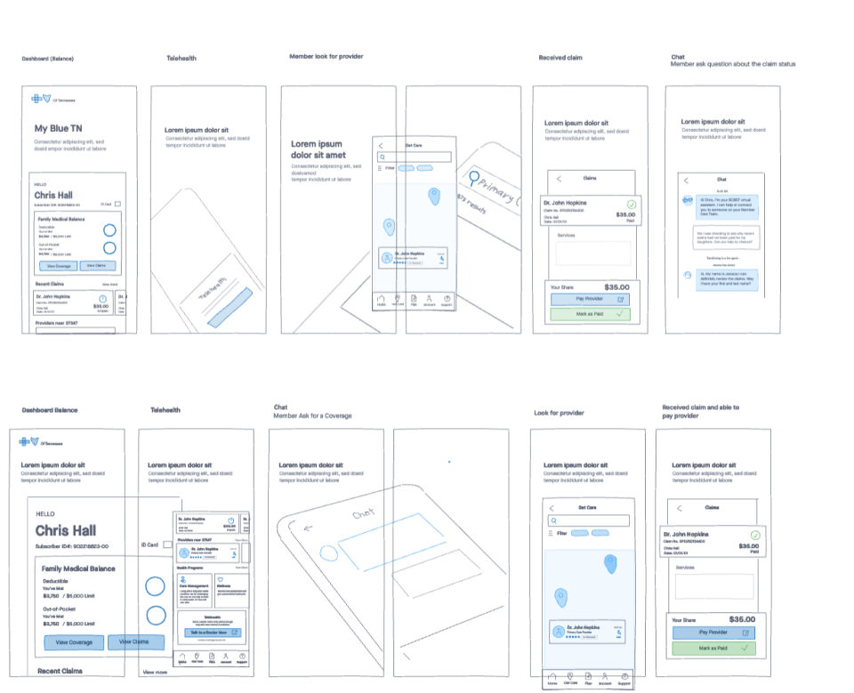
Storyboard
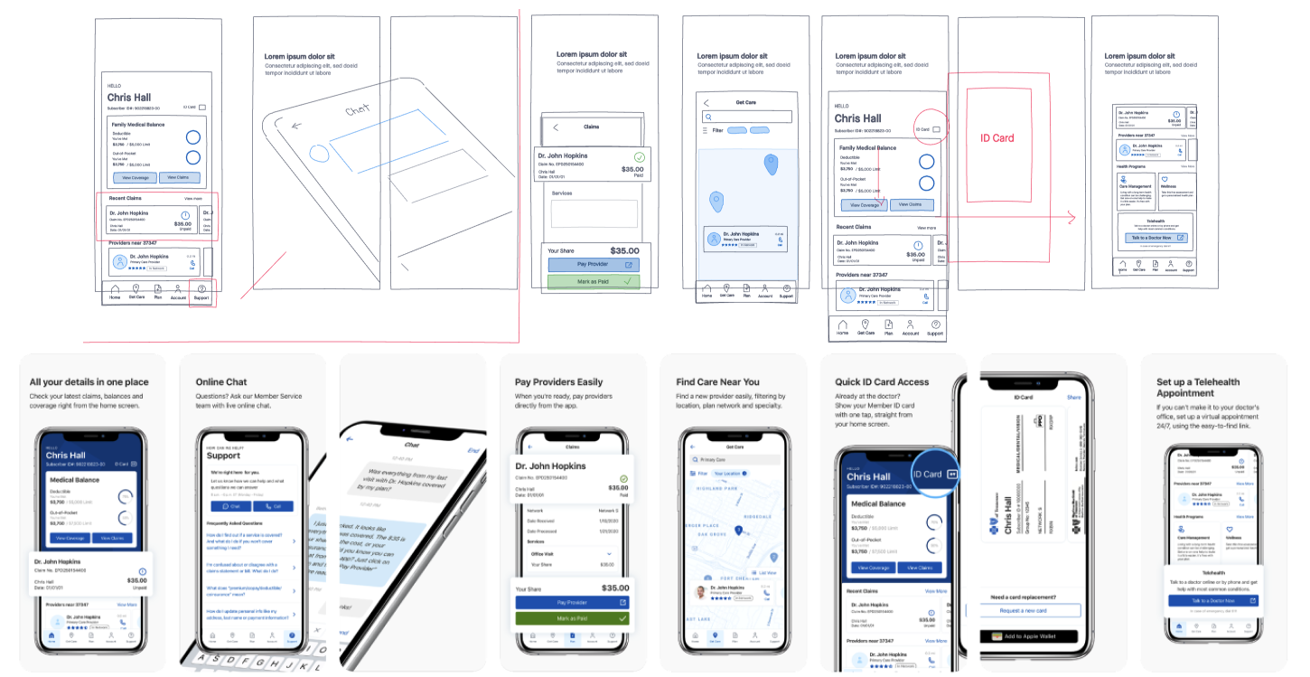
I created a storyboard and drafted a narrative that mapped out each feature in a clear, task-focused sequence. Each screen was intentionally structured to highlight a single user action, creating a logical flow that mirrored the in-app experience.
The copy was kept simple, direct, and action-oriented for clarity and quick comprehension. I collaborated with the brand voice team to refine the language, ensuring it aligned with established tone and communication standards.
I've made multiple concept versions exploring with layout structures, screen hierarchies and presented them to stakeholders for feedback. We refined the messaging and visual layout that was aligned with product goals.
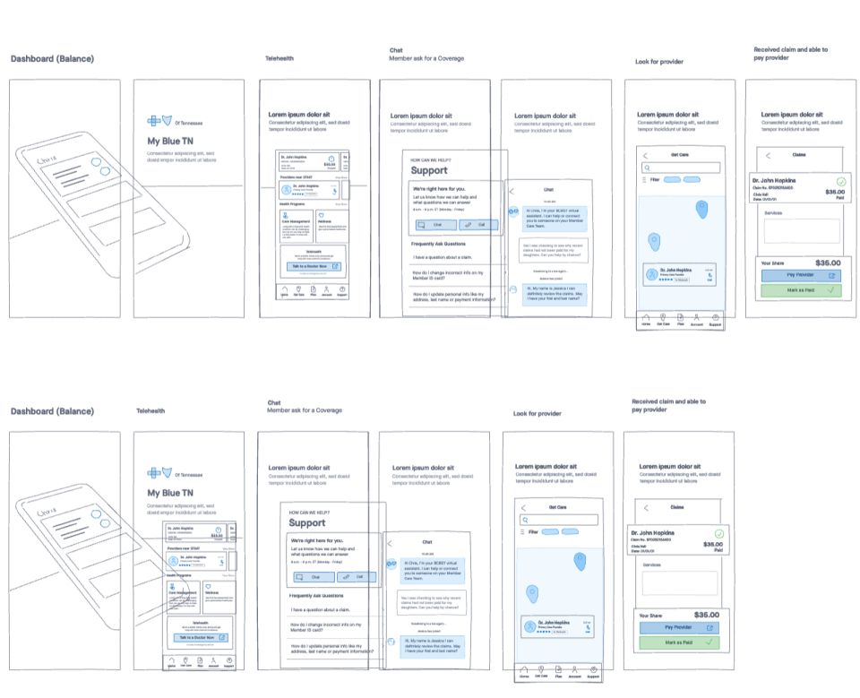
High-Fidelity Design
I translated the storyboard into high-fidelity designs and continued experimenting with layout, background color and device mockup variations.
The goal was to strike the right balance making sure it highlights the functionality of the app and messages were clear and easy to read. These designs were reviewed collaboratively with the product team.
Implementation
The final design that was well received with the team was the version where we used a plain white device frames to minimize distractions and keeping the focus on the app screens. For the background, I introduced a diagonal blue element that provided visual contrast to the copy and subtly guided the user's eye toward the next screen.
For implementation and hand-off, I've prepared the final assets with specifications and dimensions for both Apple App Store and Google Play Store and supported the engineering team for design QA and testing across iOS devices.