BCBSTN Mobile App
A complete redesign of the BCBSTN mobile app experience. Launched in August of 2021, offering members a new way to engage with BlueCross.
Team
Responsibilities
Product Goal
The current mobile app is outdated due to a legacy environment that presents ongoing issues with performance, security, and restricting the implementation of new features.
The primary goal is to transition the mobile app to a cross-platform framework and redefine the user experience to align the product with evolving member expectations and increase adoption and engagement.
Understanding Members
Gather research and analyze problems
Meeting Expectations
Assess pain points, evaluate constraints
Ideate and Test
Design, userflows and test solutions
Implementation
Design system, documentation and handoff
Outdated App
Leveraging insights gathered from usability moderated and unmoderated studies, alpha testing, qualtrics survey and moderated UX studies diving deeper into user behaviors and motivations.

Users expectations are shaped by past experiences with other applications.
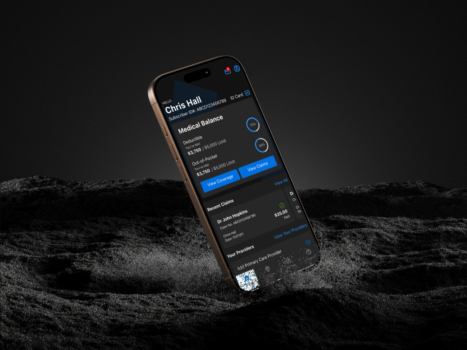
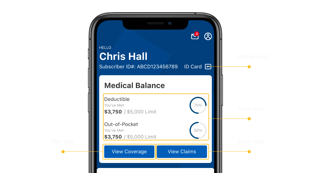
Dashboard showing lists of all navigation without a clear hierarchy.
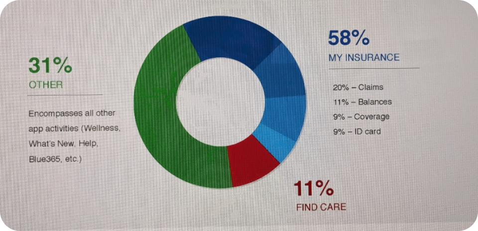
What data tells us
Based on data how members use the app in relation to insurance: Claims: 46%, Balances: 24%, Coverage: 19%, ID Card: 11%
Key findings
There are two main reasons members are going through the app.
Pre-Visit
Users wants to know ahead what their plan insurance covers for a certain procedure or service.
Checking providers that is in-network and search nearby location.
Post-Visit
After visit users wants to know how much they need to pay for the procedure or service.
Showing users overall balance accumulated through their payments.
Prototyping Journey
Surfacing the important entry points and information accessible in the dashboard regardless of their journey.
Checking Plan Coverage
Users can easily view their medical plan coverages ahead of their visit and able to look for service or procedures and estimate cost.
Show ID Card
Users can quickly pull the ID card from the dashboard while in the doctors office and share to their provider.
View Claims
After providers visit, users can easily view recent and past claims and pay through the mobile app.